How to make WebMynd
 Friday, September 17, 2010

The creative brief
The main aspect of their brief was to create an identity which would communicate the idea of collecting everything you look at on the web in one place and to inspire the idea of extending your memory. They wanted to make a tool that people would prefer to use in place of the old fashioned way of bookmarking and tagging websites. They also wanted the logo, or some element of it, as a button to indicate when the plugin was in use therefore colour was of great importance.Getting started
Initially, I took the brief at face value and brainstormed some ideas. I wanted to create a concept using the initial from WebMYnd and the first concept which was produced as as follows. The simple lines created an abstract reference to a brain (an idea which the client had experimented with but did not like the appearance of a brain. This design captures the essence of a brain but at the same time forming a ‘W’.
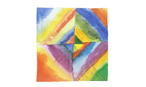
I am a great fan of the works of Wassily Kandinsky, a Russian artist, printmaker and theorist. One of the most famous 20th century, Kandinsky has been credited with painting the first modern abstract works. Below is one of these works from which I took inspiration as to the colour palette which may suit the WebMYnd logo. The use of colour is broad yet it is not offensive on the eye and stands out enough to intrigue the audience. This is what I wanted to achieve so all I needed now was the correct design to show these colours.
Drafting and development
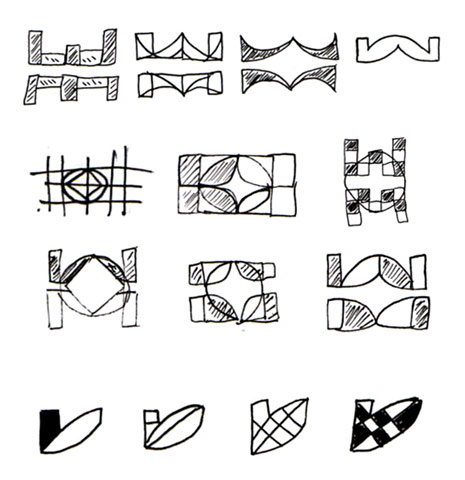
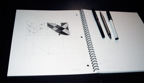
I consulted the client and the idea of creating a monogram using the ‘W’ and the ‘M’ was decided on to take the project forward. Below are my initial sketches.
Colours
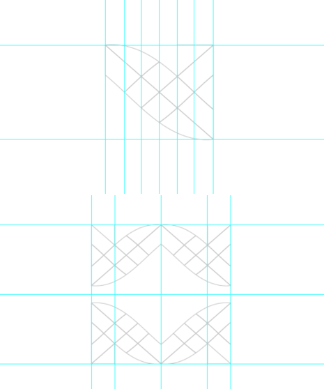
Once the four elements were plotted and finalised, I looked at possible colours. Below are some combinations which I experimented with.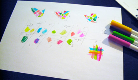

Final colour placement and concept presentation
I tried many combinations. When dealing wit the use of colour in this quantity, it is a case of trying until you find the right solution. Below is the finished design which was selected by the client.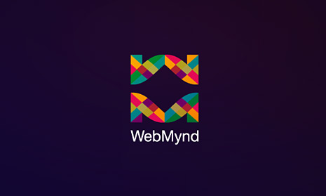
Delivery and feedback
The client initially loved the concept and used it for a number of months however after some further discussion between themselves, they decided to choose a different design to move forward with however they still retain the rights to the design, should they wish to implement it in the future.I would like to thank the creators of WebMYnd and wish them every success for the future. It was a pleasure to work on this project and this design is one of the more popular with clients when they see my portfolio. Of course, I welcome any comments regarding this specific article or my design process in general. Thanks and enjoy!
Credits
This case study is written by David Pache. Want to submit your article to Web Designer Wall? Please contact me.This is a copy of webmynd
 RSS Feed
 Twitter


0 comments:
Post a Comment