 RSS Feed
 Twitter
How to make "Smashing Network"
 Friday, September 17, 2010

Follow Smashing Magazine
You can follow Smashing Magazine on Twitter and subscribe to the Smashing RSS feed.
The Brief
It would be fair to say, I asked ‘many’ questions. So as well as asking Vitaly to fill in my online logo request form, we then proceeded to correspond via email. It was crucial to get on the exact wavelength and to ask questions that might not have initially seemed relevant.- What image did Smashing Network need to portray?
- How close, visually, should the new Smashing Network logo be to the main Smashing Magazine logo?
- Could it have it’s own unique personality?
- Should it be identical in style to the existing brand, as much as is humanly possible?
- Could we take a whole new visual approach, creating a totally unique Smashing Network brand?
As tempting as it was to go mad with a brand new idea or concept, I personally felt that the Smashing Network logo should be as close to the original brand as possible. Vitaly confirmed that the Smashing Magazine brand is crucial and that any new logo should be based on the existing Smashing Magazine brand, look and feel.
The new logo needed to inherit the existing look.
Stage One
With the brand boundaries established, I could move onto getting my fingers dirty. The first step was to create the main logo, this basically required a change of tag line only. So as you can see below, we kept the main logo and just adjusted the wording from ‘magazine’ to ‘network’.
At this stage I did offer up some alternative font styles for the ‘network’ wording, but after seeing them, Vitaly was sure that the font should be the same as the original logo.
As a designer, you still fight the urge to want to ‘play’, to show the client alternatives and variations, by doing this, it was easier to see that the best way for the brand was to keep the font the same.
But it was not an instant result to get this far, I did explore alternative fonts and subtle variations in style. So on the surface, it looks like easy peasy, knocked out in 5mins. Hindsight is great, but not always applicable. So I guess with some backward and forward shuffles, it took a few days for us to decided that the tag line should be in the original font. Job done.
Stage 2
Stage 2 did take some time to come to fruition. Once again, my personal desire to show ‘imaginative’ and ‘pretty’ logomarks surfaced.
In the end, I came full circle. Kudos to Vitaly to sticking to his guns all the way through the process, one client who knew exactly what was needed.
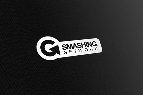
After spending some time exploring other type of logomarks, random and visually similar, we opted for the ‘G’ used in the Smashing wording. This is a recognisable mark, and creates a strong visual connection to the main Smashing brand.
I made just a few subtle changes here, you can see that I have slightly thickened it up and rotated it anti-clockwise ever so slightly. This ensures that the far right part of the ‘arrow’ has a perfect straight edge, opposed to the slightly off vertical edge in the original. I did this so that the wording, when left aligned with the ‘G’ would sit flush, rather than having an awkward gap. The original on the left, and the revised ‘network’ version on the right.
With the logotype and logomark sorted, we now had to find a practical way to put these together.
Stage 3
I bombarded Vitaly with yet more questions, thoughts and various practical considerations about the intended use of the logo/badge. It’s worth noting here that this not really a logo, but more a ‘badge’. The Smashing Network Badge so to speak. The rules of engagement had to be looked at slightly differently here.
Members of the Smashing Network would have to place this badge on their website. Website owners give much love, care, attention and time ensuring their own design works and performs both visually and practically. Being asked to place any other graphic, logo or badge can cause some perfectionists to balk at having something ‘foreign’ on their perfectly crafted website. Conversely, some website or blog owners ‘collect’ badges like they are going out of fashion, so we needed to create a badge that hopefully worked for the ‘majority’.
The badge needed to look ‘nice’, be practical and serve the function of being a badge of honour so to speak. Being part of the Smashing Network is a privilege.
So to keep things ‘real’, I looked at many other types of ‘badges’, one that springs to mind is the 9Rules logo of course. The logo itself is just gorgeousness realised, but it’s also a badge of honour that people wear with pride on their sites. People ‘want’ to have that badge, it’s not a ‘handicap’.
So armed with the knowledge of both website design perfectionists and vice-versa, I came up with the badge container shape you see above. It’s not a predictable straight edged badge, neither is it totally free floating, but it is a combination of structure and variety. Following the contours of the logomark and the logotype, creates a snug looking badge.
Stage 5
After coming up with an initial design, I asked Vitaly to field the idea to the members of the Smashing Network at the time, to gauge some feedback and to see if there were any issues or specific style requirments to take into consideration.
Feedback was positive, with no significant changes, we then created several sizes of the main badge style. Then proceeded to create various colour and tone versions. Again, this was to pre-empty any website owners who have a very specific colour palette going on, on their website.Some of the websites in the Smashing Network also have their own visual brand to maintain. Offering the badge in both full technical colour, neutral and mono styles ensures everyone is catered for.
Taking the main badge a step further, I then created the ‘G’ logomark on it’s own, to act as a recognisable icon in it’s own right. This can be used to reinforce the main badge, possibly using it as a small badge in a footer or sidebar for instance. But this ‘squared’ version is not compulsory, more of a ‘bonus’ badge for those that want to make it very clear they are proud members of the Smashing Network.

The final image files had to be flexible, so all are workable as transparent PNG’s. So no fancy drop shadows or background vignettes here. Clean and crisp edges all the way.
It was important to offer varieties of badge size and colour, whilst retaining the original visual brand identity.
 This is a copy of logo & Artical

0 comments:
Post a Comment