How to make bonfx logo
 Friday, September 17, 2010

First, let’s start with the end and then work through how I got there. Here is the final logo in production now on my website and collateral, in black and white:

Now we’ll run through 23 steps of this logo design process and see just how crazy it got. All good logo design processes follow a similar path.
Step 1: Brainstorm logo concepts
The first step in creative is brainstorming is to just improvise some visual ideas guided by the research done in a previous cycle of work. In this case, since I was the client and the designer, I already had worked out my goals for aesthetics, evaluated my competition, and decided where I wanted to end up. The important thing at this stage is to generate too many ideas and leave nothing unexplored, even if it seems at odds with the research and stated objectives:
Step 2: Bring a logo design concept into further focus
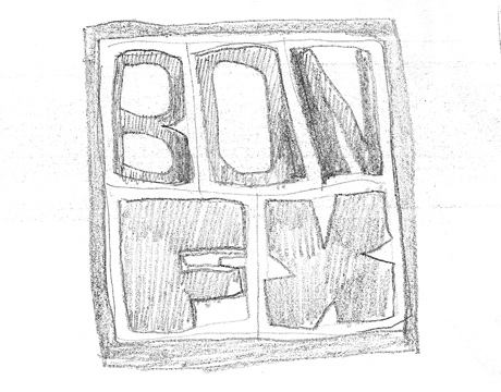
I had an initial visual I wanted to pursue, on a chunky box theme:
Step 3: Pursue even random logo design concepts beyond simple lines
But no…and then I was off down rabbit trails when I realized the initial “box idea” turned out to be a “bag idea”. Even though I wasn’t going to use the idea, I still make it a point to let my pencil enjoy itself and get creative and make wasted ideas look nice. Well, they aren’t really wasted really. What’s more fun than doodling? And what’s better than coffee?
Step 4: Free associating logo design concepts
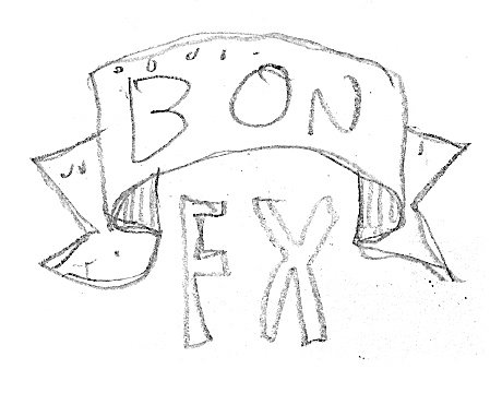
I’m really getting out there, trying to get sillier so that I can get some perspective on where I need to be. A banner? Why not? I need to “say” something fun with the logo I’m looking for…I’m drawing quickly, very small, and generating lot’s of free association ideas:
Step 5: Remain unhindered in your creativity as you hunt for the right logo design concept
Hmmm…what is that happy lamp thing from Pixar movies? He’s fun. Can he help shine some light on my new logo?
Step 6: Never give up, but keep iterating, and always letting your creative juices have their way
Ok, no light from the lamp per se, but I’ve filled a sheet of paper at this point. No luck yet. It’s the end of the road for this creative burst…
Step 7: Give yourself plenty of white space as you pursue the logo design concept
So I grabbed a new sheet and went right back at it. Let’s look and see some places this next creative brainstorm took me. There is something about a blank sheet of paper that forgives the past, keeps only the good, and invites the artist to explore:
Step 8: Try all the different directions for a logo design that you can reasonably and quickly prototype
I really felt like I wanted that square idea from earlier to work. It was a feeling I was after, and I thought it was squarish, but not quite. I needed movement. Can I move some lines around inside a square? Stability and playfulness?
Step 9: Try a different angle on your logo design concept when your current perspective fails
Nope, not working. So let’s go with the “stable” thing, keep the straight lines so we avoid looking like a 60′s psychedelic poster. Oops, I went from the 60′s music poster to the 50′s movie poster. Fine, fine…I see “staring Charlton Heston” floating somewhere…
Step 10: Work diligently to trap the mood of the logo design, but don’t worry about specific designs
Maybe we can stack some blocks? Have some grown up fun? Maybe not. I’m not sure about the fun idea at this point, but I’m thinking we need friendly and I’m groping again to get there. This is too disorganized but I like the freedom concept that is lurking in this one. It’s about mood at this point, and not about execution or final design. You need to trap the mood and then explore that. I’m committed to hand drawn letters for sure:
Step 11: When the right path to take on your logo design presents itself, you will know it
Nope, too rigid. Let’s speed the pencil up and get the left brain to take a breather. The left brain often starts saying “I know best, give me the pencil” and you start listening to it. “You want lines and grids” it says. So you start drawing lines, but lose emotion. But I don’t want boxy lines and grids! I want to break out of this entirely. Right brain takes the pencil:
Step 12: Refine the vision for the logo design
That felt good! Let’s jam on this free-flowing theme and eschew all manner of lines and grids. Left brain at this point is observing, slack-jawed, and wondering where this is going, grumbling like a back-seat driver, waiting to say “I told you so!” However, I get the idea to use the structure of flowing lines to build up something more substantial and weighty:
Step 13: Try variations within a tightly narrowed focus for the logo design
After coloring this in, I get an ah-ha moment. I grab another sheet and rapidly sketch out some variations on the free flowing handwriting thing:
Step 14: Refine the logo design concept using the freedom of pencil to bring out what might be the details of the final art
I quickly flesh out and fill in another handwriting sample:
Step 15: Eliminate extra logo designs and narrow the options to only a few concepts
Ah…I can see where this is going. This is not it, but is like it. Let’s get even loser and write in a manner that will produce lines expected to be further improvised on. I narrow it down to four looks and now things are getting clearer and tighter:
Step 16: Arrive at the final logo design and complete the brainstorming process
I now see where I want to go. We are getting friendly, stable, professional, and clean at the same time. This one is it…
Step 17: Begin production of the logo design by beautifying and clarifying the lines and curves by redrawing them
Now we transition out of the brainstorming phase of the logo design process and into the production phase. The first thing we must do is blow this little tiny sketch way up and clean up and solidify the lines. The beauty of working small and then going large is that you capture a lot of gesture that is lost when making larger movements with the arm. The fingers do an amazing job on a small level. I scan the sketch in and blow it way up in Photoshop. I then blur it so I can’t see precise lines, and then fade it back to about 50% gray. I’m going to draw over this print out which is now about 5 inches across, up from about the 1 inch of the original:
Step 18: Produce the final preliminary drawing of the logo design and make it ready for vector art production
Now I use more controlled flowing movements of the pencil to establish graceful defined lines. I then color the whole thing in to see what, for the first time, the final logo design is going to look like. It’s like one of those Polaroid moments, when the fuzzy film gets some clarity and you know for sure if you got the shot or not. In this case, I got what I was after:
Step 19: Draw the logo design in Illustrator
I scan this drawing back into Photoshop and adjust levels to get my grays to nice charcoal blacks. Now it’s ready to be imported into Illustrator. I proceed to use the Pen tool to hand draw all the same lines one final time in vector. This gives us the ultimately clarity and crispness. If something in the logo design was off at this point, it’s way too late to fix it. However, minor refinements are easy and expected at this point. I balance out some spacing, tighten a few lines, etc., and Left Brain is happy to get of the bench and make itself useful. Left brains work best when you tell them what to do, not why to do it:
Step 20: Import the logo design into final production software
I’m basically done with the core artwork in Illustrator. Now I need to import the logo into Fireworks where I have my web page design mocked up and ready for production. I improvise a variation on the color scheme for the header of the site:
Step 21: Release your new logo design to the client and the world
I export the graphics and import them in to my WordPress template using Dreamweaver and move it to the web and check it out in Firefox. This logo design is now live!
Step 22: Recap and compare the steps to see the final drawing of the logo design to the final vector art
So how does the approved sketch compare to the final production ready logo design? They should be about 90% the same, where the final 10% is refinement and not fundamental design change. I think we see that clear hear. I’m pleased with how this went:
Step 23: A closer look at the final art for the new logo design
And our last step is back to our first step, and we take a closer look at the final art. What a great trip it was!
In Conclusion:
I hope this was an enjoyable read for you, and that you learned a few things about the logo design process you didn’t know before you started. Also, I hope that you understand a bit more about our creative brainstorming process and how it might apply to your logo design project.Thanks for reading!
Its a duplicate Artical
 RSS Feed
 Twitter


0 comments:
Post a Comment